
Imagine this: shoppers are enjoying a new variety of tomato soup. The demand for it suddenly increases, tripling over two months. You'd want to react to this information. It would be better if you could spot an opportunity. However, you still need to complete data analysis to understand that. The result is a product that could be making you more sales is at the bottom of your shelf.

You also haven’t increased its product facings. And then you ask why you aren’t increasing sales. It's easy to understand. The retail buyer might have placed a large order to meet the increased demand for the product. However, it's all for nothing if you don't reposition the item on the shelf or provide more space since it won't sell at its full potential.
Fortunately, you can take many actions to correct this before it becomes a bigger problem than when you first discovered it. We have two that we would like you to consider.
The first option is to find and purchase specialized software designed to help you analyze your data. You'd also need a dedicated person or team to operate the software. If you need more time or resources for this, your second option is to turn to professionals who deliver a service known for spotting and capitalizing on opportunities.

What is shelf space efficiency?
Failing to adjust the shelf space for your most popular products speaks directly to lost sales. That's why shelf space efficiency is so vital. It ensures your customers find the products they want, meeting their demands.
That’s not all though.

Let’s consider your purpose as a retailer. Yes, part of it is to maximize your sales and ensure your floor space generates as much profit as possible. However, your other goal is to please shoppers and encourage them to spend more time in your store.
As they spend more time, they add more products to their shopping baskets as they see more of your merchandise. When done right, you transform what could have been a boring shopping trip into an experience that keeps them interested.
It's not experiential shopping, even if that's a great idea. Instead, this is about presenting products in the best possible way so that shopping becomes one less thing your customers need to worry about. Instead of dreading going to the shops because they think they'll struggle to find what they want.
That’s what efficiency gets you. By optimizing everything on the shelf, you waste nothing. In return, everything that should be in its place is. When that happens, everything becomes easier because everything is rational, and your customers know what to expect.

Why is ensuring shelf space efficiency critical?
Understanding efficiency at a shelf level makes it easy to argue why it’s worth pursuing. When you are efficient in one area of your store, it becomes easier to be efficient elsewhere.
But that doesn’t speak to the advantages of seeking out efficiency.
1. Shelf replenishment is less complex and confusing
By being mindful of what shelf space each product receives and knowing how often it sells, you are in a prime position to optimize your shelf replenishment efforts.
How? By looking at your sales data, you know when your shelves will be empty. With this information, it's best to ensure your products sell out at an even rate so you don't need to take a reactive approach to shelf replenishment. Instead, being proactive allows you to replenish your shelves sensibly.
2. Products get the shelf space they deserve according to sales
When you're efficient in planning out your shelf space, the result is that the products that sell the most receive the most room. And rightly so. Your customers demand these products more than others, so providing them with more facings means more visibility and sales.
Meanwhile, you can reduce the space provided for your poor-performing items. This optimization of your shelf space ensures each product gets what it deserves.
3. Shoppers enjoy a better experience in-store
Because you're giving more facings to your popular products, you're also creating a better in-store experience for your customers. They can find what they want with little fuss.
Instead of them walking into a store and trying to find the products they need, you're making it easy for them. Appropriate signage and merchandising complementary products nearby to those they want also help you to improve the experience. While walking to the shelf to pick up the product they want, they add other items to their shopping basket.
Blockquote
If those are the advantages, what are the disadvantages of not being efficient with your shelf space?
1. Understocked shelves
The first disadvantage of inefficiency is that it leads to understocked shelves. It’s the antithesis of our first benefit - less complexity around shelf replenishment. Because you’re not looking at your data or completing any analysis, you’ll struggle to know how long it takes to run out of stock.
It might be sooner than you think.
That means your shelves will empty when you least want them to be, frustrating your customers while you struggle to fill the gaps.
2. Overstocked shelves
An understocked shelf isn’t the only concern. By not observing buying patterns or knowing what your customers want, you face overstocking your shelves with products that won’t sell.
That leaves little to no space for the products that do sell. When you move the poor-selling products from your shelves and replace them with more popular ones, where do you place them? Your stockroom. And then your stockroom is packed?
Something has to give, and you need to have a good relationship with your supplier and have a deal that has them take back any unsold products to have space for anything else.
3. Products are not where they should be
Finally, inefficiency can often lead you to place products wherever you find space. That means an unpleasant shopping experience for your customers as they search for what they want.
When one product isn't where they expect it, does that mean other products are out of place too? It's disconcerting if you put yourself in your shopper's shoes. How must they shop if they can't find anything?

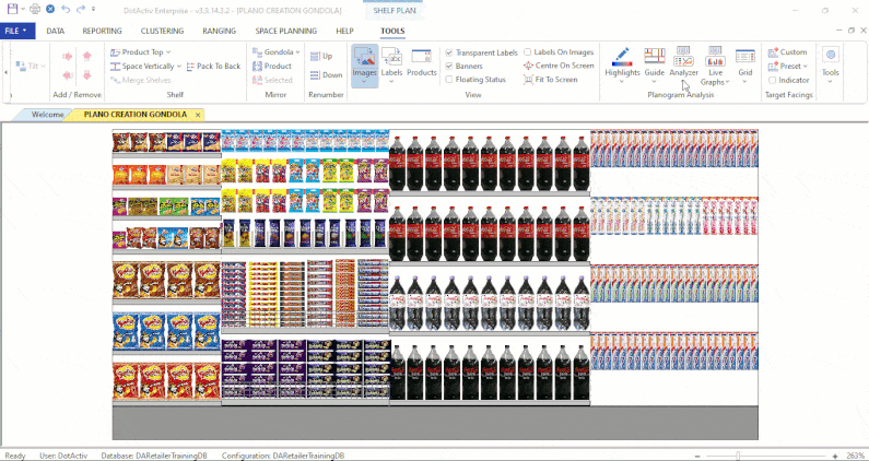
How can you analyze shelf space efficiency with DotActiv?
1. Using planogram software to ensure shelf space efficiency
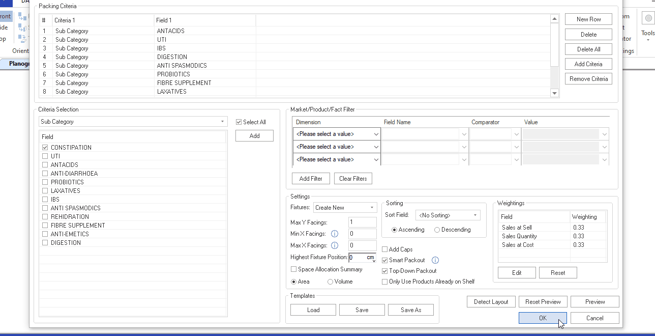
At DotActiv, our software offers the feature of reporting on shelf space efficiency. When using these reports, you can determine shelf space efficiency by analyzing several factors such as Days of Supply (DOS), Space allocation, product placement, and performance of the products on the shelf.
The reports used to analyze these factors to promote shelf space efficiency include:
- A Fixture report provides fixture attributes (height, width, and depth) about the shelf. It helps shelf planners plan and allocate space for products effectively.
- A Shelf report specifically indicates which drop and shelf a product is not performing as intended through the Days of Supply, Weekly Movement, Capacity, and Facings.
- A Change report shows one of many areas, such as the congestion factor. If it increases drastically, it means products have too close to each other on the shelf.
- A Plano Performance report analyses a variety of performance measures. You can use these performance measures to achieve and fulfill your strategic and financial objectives.
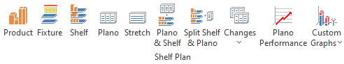
The above image shows the main reports to determine shelf space efficiency. The remainder reports offer more information about the product on the shelf and how to utilize space, maximize the shopper experience, and yield high returns on investment (ROI).
Furthermore, planogram automation improves shelf space efficiency when it comes to the features that we offer.
You can streamline your category management processes and improve the efficiency of your shelf space by optimizing space allocation, aligning assortment planning, enforcing category rules, automating planogram generation, and enabling visual analysis.
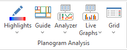
In addition to the reporting feature, you can also use the planogram analysis tool. One of the functions of this tool is the Live Graphs to determine the measure fields, data fields, and group fields. Its flexibility allows you to manipulate the data needed at that time.
Since one of your main objectives is to maximize profits, you can compare the DOS, sales performance by SKU, Brand, or any other chosen metric for product lines added on the planogram.
Utilizing GMROI also helps you understand the return on your investment in terms of profit versus space allocated. Using this in conjunction with DOS can identify opportunities for further profit maximization. It accelerates your ability to read the planogram and make informed decisions regarding any product lines needed to be added to a planogram, increasing or decreasing the number of facings per product line.
Database integration is necessary to increase your efficiency. We recommend two-way integration as it allows you to leverage real-time data, enhance your analysis and reporting capabilities, streamline workflows, enable accurate assortment planning, and facilitate better collaboration.
2. Diagnosing shelf space issues with DotActiv software
You can improve shelf space efficiency by optimizing space allocation, enhancing product visibility, streamlining assortment planning, ensuring compliance with category rules, saving time and costs, and facilitating data-driven decision-making.
It also helps you maximize space efficiency by aiding in ranging decisions to ensure the right product is available at the right time and place while maximizing your profits.
Additionally, the DotActiv software offers a planogram live graph feature to improve shelf space efficiency. It achieves this by enabling fully customizable graphs, which we view as we build planograms. It assists us in making better judgments on space planning and updates live as we move items on your planogram to reflect the facts for your chosen products.
The feature provides control and allows informed decision-making concerning the optimal assortment and the most efficient shelf space afforded per product line. Meanwhile, you gain a valuable ability to draw deep insights from the dynamic visualization of the live graphs.
When analyzing reports, you can identify inefficiencies such as out-of-stock situations, shelf space wastage, and inconsistent product placement. By looking at the visual provided by the DotActiv software, you can deduce if a sales performance imbalance exists between product lines, if there is an issue with days of supply, and the relationship between sales and profit achieved.
It concerns the cubic space percentage given per product line, SKU, or brand and depends on the selected view.
So how can you implement the software to address any inefficiencies?
- Define Objectives and Goals. Understand the category and how shoppers shop it.
- Gather Data and Set Up Integration. Develop a two-way integration between DotActiv and your internal system.
- Data Import and Validation. Explore the various data fields as the need arises to create data-driven planograms.
- Analyze and Optimize. On the DotActiv software, under the ‘Tools’ tab in the ‘Planogram Analysis’ section, you can manipulate and add the fields that the graphs will calculate and show as a live graph.
- Implement Planograms. Create a planogram based on the data and decisions made from the above steps.
- Monitor and Evaluate. Conduct regular maintenance and updates. Knowing which of your products performs the best streamlines the category management process.
- Identify opportunities for improvement. Assess the impact of the decisions to improve space efficiency.
Following these steps can help our clients experience success. But how do we measure success?
It depends on the agreed objectives per category.
For set categories, we focus on finding a healthy and balanced relationship between sales, profit, and cubic space allocation. We consider days of supply and other fields critical to your goals. We also take note of DOS, GMROI, and %Gondola space. The planogram flow should align with how a shopper shops the category and is easy to understand.
Thus, measuring the success of shelf spacing using the software involves tracking Key Performance Indicators (KPIs) and analyzing relevant data. The KPIs include Sales Performance, Stock Turnover, Out-of-Stock Reduction, Customer Feedback and Satisfaction, Category Performance Analysis, Space Utilization, and Planogram Compliance.
3. Delivering impact with DotActiv’s Planogram Development service
DotActiv's Planogram Development service assures planogram compliance. This service combines expertise, customization, software integration, and training to ensure a successful implementation for our clients.
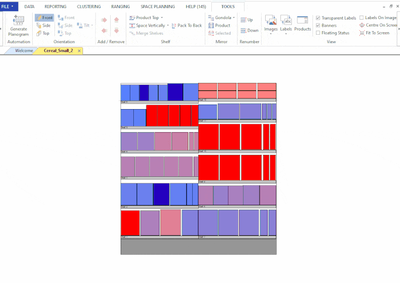
DotActiv category planners use the data provided by the client to lay out products by category. From there, we create a flow of goods and products by considering which products should occupy which space within the allocated area on the shelf. This can be accomplished by, for example, positioning the top performers at eye level or by arranging large items on the bottom shelves and the smaller items at the top.
Alongside Planogram Development is another applicable service - our Category Management Data Analysis. This service makes it possible to calculate space allocations by looking at a graph and analyzing the data via a drill-down option.
It allows our clients to use one graph to analyze performance at category, sub-category, segment, sub-segment, brand, and SKU level. Additionally, you can view the drop performance and see the shelves or pegboards within each drop.
Blockquote
It's an ideal service if you're a new or well-established retailer as it assists you in providing the right product at the right time, in the correct quantities. You can optimize shelf space by analyzing sales data, product demand, and inventory turnover. It helps you determine your ideal product assortment and allocate space accordingly.
You can also utilize this service to arrange shelves and fixtures and establish greater visual appeal. That also means there are plenty of benefits to choosing DotActiv to provide this service.
Strategically organizing products based on consumer behavior, market trends, and sales data, planograms enhances product visibility, encourage impulse purchases, and improve cross-selling opportunities.
- Enhanced sales and profitability;
- Improved customer experience;
- Optimum shelf space; and
- Increased visual appeal.
To benefit, you must know and understand the consumer decision tree. It helps to categorize products according to how consumers shop in a particular category. It also helps to drill down to the SKU level and understand how each product performs.
Doing so means it's easier to notice when a drop contains too many or too few shelves. This is due to overstocking, incorrect ranging, and not optimizing the physical space. It impedes a smooth shopping experience. It is even worse if you have shelves stocked with the wrong items - not just for shoppers but for your merchandisers, who will replenish continuously and add items not wanted by shoppers.
That's why it's critical to manage your shelf space.
Managing shelf space efficiency promotes merchandising products according to customer behavior and better stock control.
As a retailer, investing in shelf space efficiency results in customer satisfaction and loyalty and builds a strong brand image.
Moreover, it helps to prepare and plan for seasonal trends and demand changes by regularly monitoring and optimizing your product ranges. With the help of a DotActiv service, you get access to charts that reflect data-driven tactics to improve your shelf space efficiency and performance.

Conclusion
By analyzing sales patterns and the performance of products, you can develop planograms that reflect data-driven tactics that improve the efficiency of your shelf space. When you do that, you please your customers. When you please your customers, expect more sales, increased profits, and an improved reputation as a go-to retailer.
Are you looking for advice or need a category management solution that can help your business succeed n the competitive world of retail?
Why not book a custom complimentary consultation with a DotActiv expert today to hear how we can help you, or browse through our various services and software editions on our online store?