It doesn't matter if you plan to open a new store, revamp your current one or want to maintain it - you must consider your layout seriously. Choosing the right layout* design ensures that your customers can shop in your store easily. The converse is also true. Selecting the wrong store layout can prove disastrous as customers struggle to find what they want.
Execute it poorly enough, though, and we'll more than likely add it to the other reasons why customers hate shopping at your store. Of course, we don't want that for you. Instead, we want to see your store prosper as you provide shoppers with a shopping experience they want to return to again and again.
So that leads to this question: which store layout suits your business best?
The answer depends on a few factors, including the products you sell and the customers you want to attract. Store space is another factor too. But we’re getting ahead of ourselves. Let’s present the facts, and you can decide which layout suits your business best.

1. Grid Layout
The first - a grid store layout - is also the most traditional design used by many supermarkets, pharmacies, and even off-price retailers.
When last did you do your weekly shopping at your local supermarket? The changes are high that the store used a grid layout.
Characteristics include having retail fixtures (gondolas) placed in long rows - also known as ‘runs’. These gondolas are also usually located at right angles throughout the store, which allows shoppers to become familiar with the location of products.
If executed correctly, you’ll enable your customers to shop your entire store.
Advantages
- Your store is well organised and has an atmosphere of efficiency, which leads to customer familiarity;
- The maximum amount of floor space is used at a lower cost; and
- It’s easier for merchandisers to stock your shelves.
Disadvantages
- The many rows in your store can give off a cold and sterile atmosphere while it’s also difficult to see over your rows.
- There are few opportunities for special displays, and your store can appear plain and uninteresting to customers.
- This layout can stimulate rushed shopping behavior.

2. Loop Layout
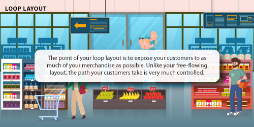
The second store layout option available to you is the loop layout, which is also known as the race track layout.

In fact, there is a reason why it’s called the loop layout as you can direct your customers in a so-called ‘closed loop’ around your store, guiding them past all your products before arriving at your check-out counter.
Advantages
- You have an opportunity to create unique displays for your store;
- It allows for a friendly and relaxed atmosphere; and
- Your customers are exposed to more of your merchandise.
Disadvantages
- In using this design format, you can often waste your selling space;
- It doesn’t encourage your customers to browse;
- It can be frustrating for customers who know what they want to buy.

3. Free-flow layout
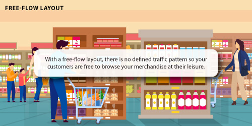
Considered the simplest type of store layout, your free-flow layout groups your fixtures and merchandise into a free-flowing pattern on your sales floor.

That makes it seem like there are no rules for this layout, but that’s not true. There are rules but just not as many.
Ironically, this can be the most complex layout to master considering that you need to keep your customer’s behaviour and buying patterns in mind.
Just a note of warning: should you have a wide variety of merchandise, this layout fails to provide cues to your customers for them to know where one department ends and another one begins.
Advantages
- This layout allows your customers to browse and wander freely;
- It leads to an increase in impulse buying as customers are exposed to more merchandise; and.
- Your store is visually appealing as there is an opportunity to create unique and exciting displays.
Disadvantages
- You don’t make the most of your floor space.
- Your stock control and handling are more complex than other layouts.
- Loitering is encouraging, which can confuse your customers.

4. Herringbone Layout
While your grid layout may be the most used layout form for retailers, if you have a small retail space, it might not make sense.
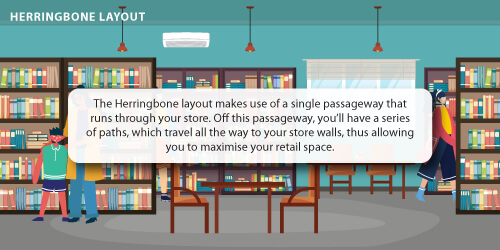
That is where your Herringbone layout comes in. It’s best used for retail spaces that are both narrow and very long.

To keep your customers in your store, you can also break up your space by offering areas to relax, such as a chair in a bookstore or a bench in a shoe shop.
Advantages
- Best suited to stores with a lot of products on their shelves but with minimal space;
- It adds visual appeal to your store; and
- You can maximise your retail floor space.
Disadvantages
- Limited visibility of all your paths can allow for an increase in shoplifting;
- This layout can make your store feel cramped;
- There is limited scope for browsing.
Conclusion
When it comes to choosing a store layout, you don’t only have to pick one of the above. Many successful retail stores use a combination. Rather it comes down to the products your store sells, the space you have available, and deciding what you want your customers to do upon entering your store.
So which one are you thinking of using?
- Grid layout
- Free-flow layout
- Loop layout
- Herringbone layout
If you’re undecided, why not speak to DotActiv? We have the software and expertise to help you choose and build out a store that’ll not only maximise your space but also your sales while simultaneously pleasing your customers. What more could you want?
Book a complimentary consultation with a DotActiv expert here and we can help you get your retail business to where it’s meant to be.
Share this Image On Your Site
*This article was updated on 14 July 2022.


